BRANDING NEXTDAYBETTER
How can a brand about empowerment feel empowering to the people it represents?
NextDayBetter is a New York–based media company that exists to create a more empowering world for immigrants everywhere. With a mission to be the go-to hub for migrant communities, it seeks to celebrate the stories, culture, and impact of the global diaspora. However, despite its powerful purpose, the brand lacked a distinctive identity that truly resonated with the people it aimed to serve.
I rebranded NextDayBetter to create a flexible, authentic, and community-driven visual identity—one that reflects the diversity, optimism, and resilience of its audience.
As Lead Art Director at NextDayBetter, I worked closely with the CEO and Vice President from the start: writing the creative brief and shaping both the strategic foundation and creative vision for the brand. I began by aligning leadership and the team around what brand identity truly means, emphasizing how a logo cannot define a brand on its own but an embodiment of shared values, voice, and purpose.
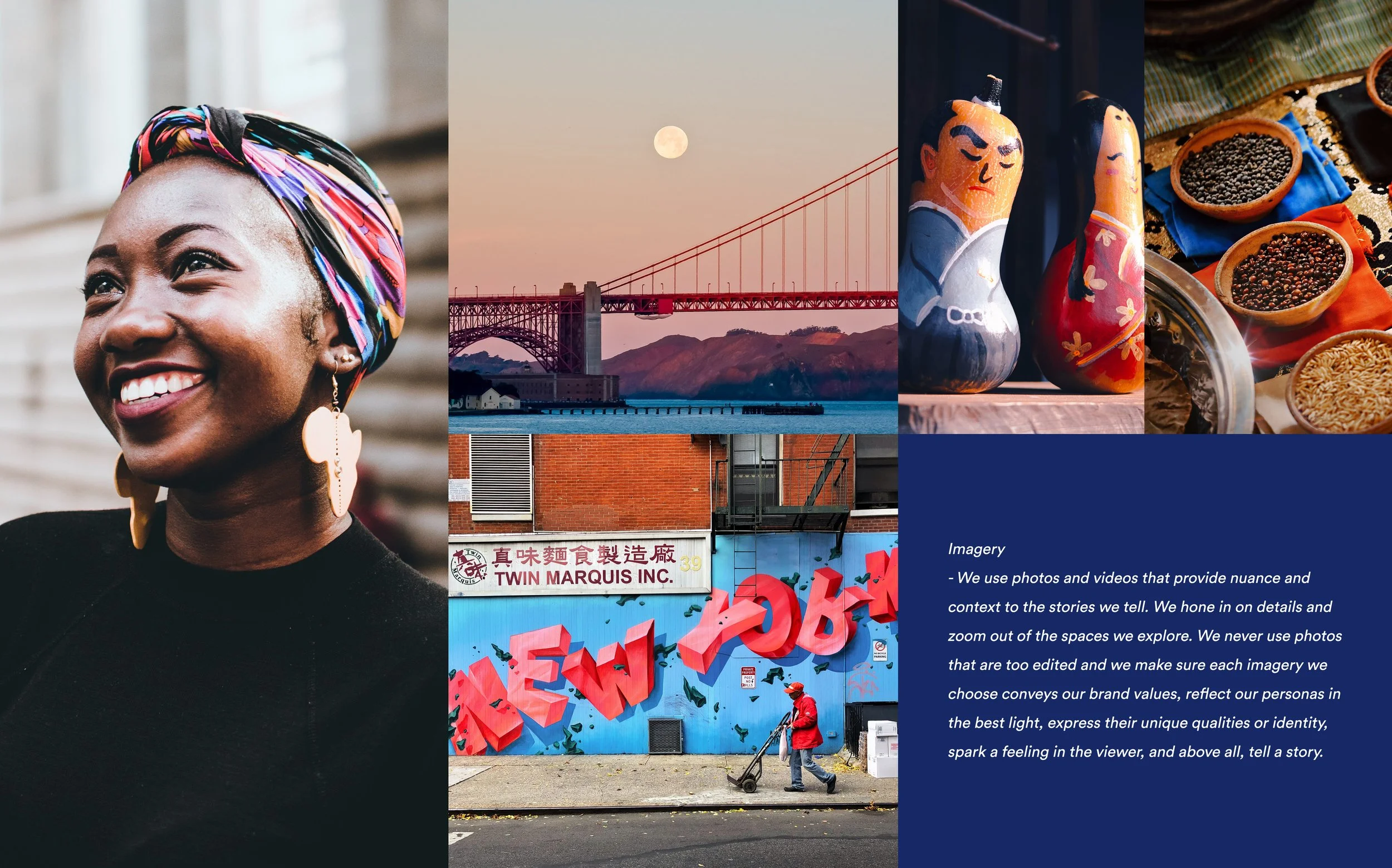
To ensure every creative decision was grounded in creative strategic insight, I conducted brand attribute workshops and stylescape sessions alongside leadership, art directors, writers, and producers. Together, we explored how our target audience lives, the culture they celebrate, the language they speak, and the media they consume. This research-driven and collaborative process became the foundation of a new identity system that speaks not just for the community, but with it.
Here’s how we did it.

Discovery & Strategy
We began by uncovering insights through research and workshops to understand how NextDayBetter’s mission could truly connect with immigrant communities. We defined the brand’s core attributes: resilience, transformation, and belonging—and aligned leadership on a shared vision of what the brand represents beyond its logo.
Concept Development
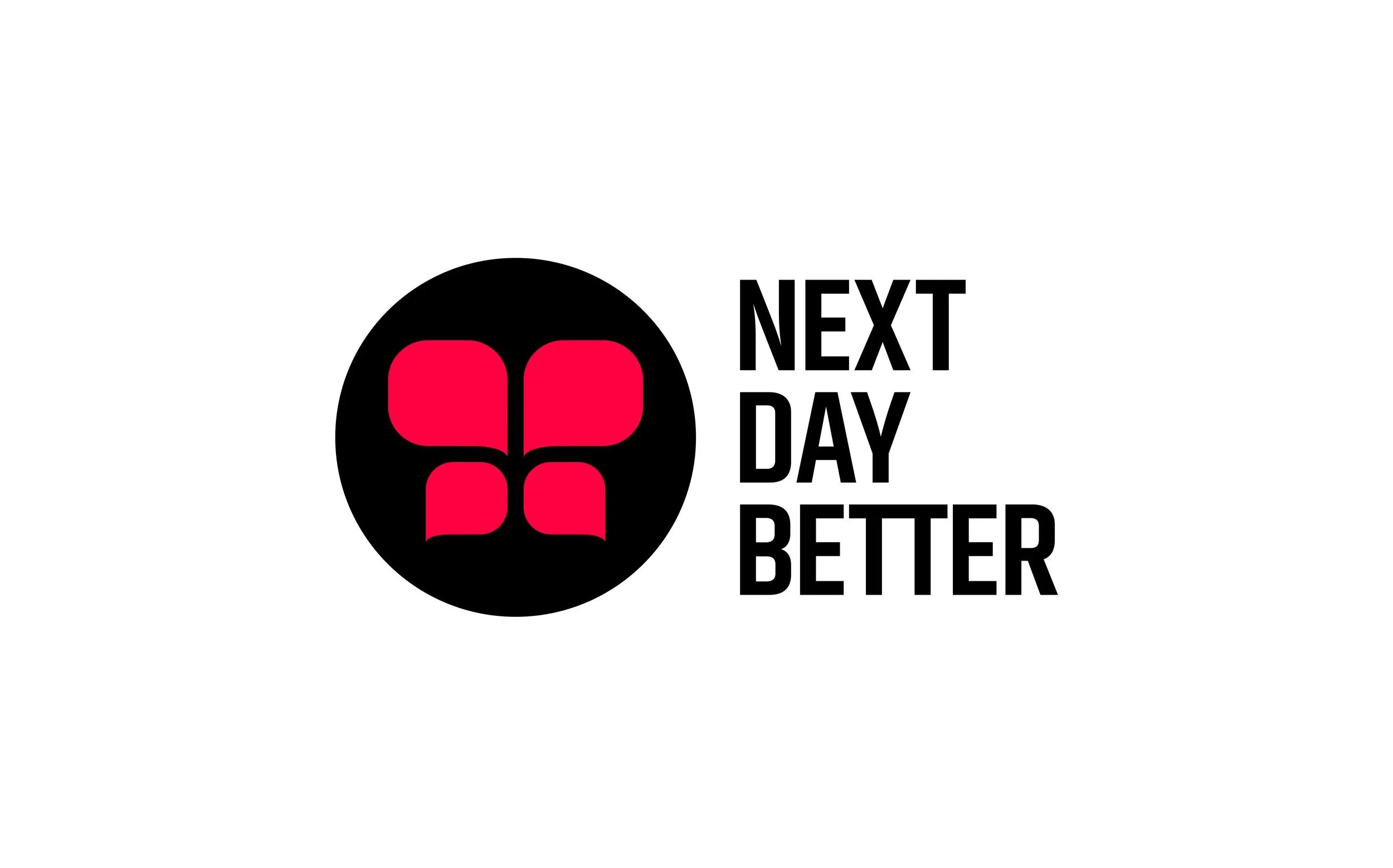
Inspired by the butterfly—a powerful symbol of migration and change, I developed a visual metaphor that embodies the strength and journey of the migrant experience. I reimagined the butterfly’s wings into symbols of conversation and story, representing the voices that lift immigrant communities and help them soar.
Design Exploration
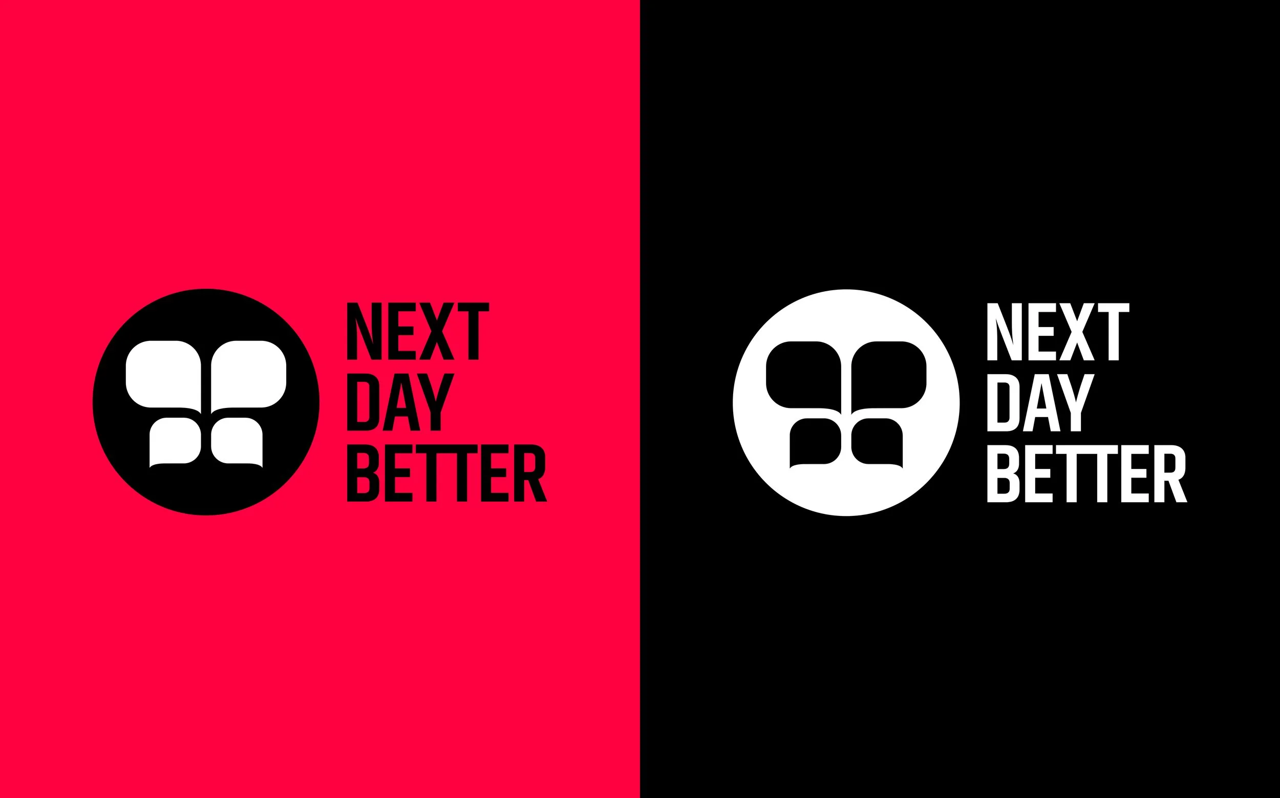
Finally, I translated the strategy into visuals through stylescapes, typography, and color studies, building a system that feels vibrant, adaptable, and deeply human. Every choice was grounded in insight and inspired by the color, energy, and optimism of the communities NextDayBetter exists to empower.


Implementation
The result was a comprehensive and cohesive brand and design system that is scalable across all media, storytelling, and community platforms while ensuring consistency and authenticity at every touchpoint. The new identity gave NextDayBetter the clarity, confidence, and heart to share its mission and to truly connect with the people it was built for.
—
I’m especially proud of this work because it allowed me to wear many hats: from strategist to writer to leader. My role went beyond design. It was about understanding brand strategy and carrying that vision through to the creation of an entire brand system. I co-authored and designed every page, shaping an identity that everyone on our team felt truly proud of and was built on insight, collaboration, and a shared commitment to craft.